Case Study
Client
Gimme
Industry
Food
Scope
Gimme came to us with a bold ambition: redefine how a modern snack brand can look, sound, and compete. They weren’t interested in blending into the saturated snack aisle — they wanted to claim space with a personality that felt cheeky, energetic, and unmistakably contemporary. What they lacked was a cohesive brand system that could translate that attitude into something commercially sharp and visually magnetic.
Brand Book Communication Brand Identity Brand Signature
Branding Design Graphic Design UX UI Design
Context
Nothing but yummy goodness!
Challenge
Over the Moo needed a fresh creative direction that captured the joy and indulgence of dairy-free ice cream while standing apart in a market crowded with minimalist or overly technical designs. Their previous visuals weren’t cohesive enough to build strong recognition. The challenge was to reintroduce the brand with a look that felt expressive, fun, and unmistakably flavour-driven.

Solution
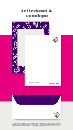
We developed a playful illustration-led identity that brought each flavour’s personality to life. The design combines bold, colourful scenes with an organised packaging structure that ensures clarity and quick recognition in the freezer aisle. The aesthetic embraces joy and character, reflecting the lighthearted essence of the brand without sacrificing readability or brand consistency.
.png)
Outcome
This refreshed direction has strengthened brand recall and significantly improved packaging visibility. The expressive illustrations translated exceptionally well across social channels, giving Over the Moo a more engaging and shareable presence online. The new look captures the delight of the product and gives the brand a memorable identity that resonates with both families and plant-based consumers.

Deliverables
Brand identity, packaging design, colour strategy, visual guidelines, typography.


