
Case Study
Client
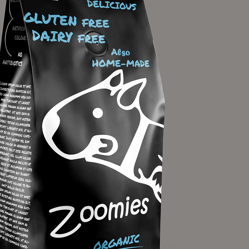
Zoomies
Industry
Pet Food
Zoomies arrived with a simple truth at its core: pets aren’t just companions — they’re personalities. The brand wanted to move away from the predictable, overly-cutesy pet-industry aesthetics and instead build something that felt bold, modern and full of character. Their products had energy, playfulness and attitude baked in; the brand identity needed to reflect that with the same intensity.
Scope
Packaging Design Branding Design Graphic Design
UX UI Design
Context
For the love of pets.
Challenge
Zoomies approached us with a desire to capture the spirit and energy of dogs who live life at full speed. Their early branding lacked personality and failed to differentiate them in the increasingly competitive pet-food space. They needed an identity that felt playful yet trustworthy, full of movement and joy but still clear and premium.
Solution
We built Zoomies around the idea of motion. The visual language uses dynamic shapes, energetic colour combinations, and strong typography to reflect the exhilaration behind the name itself. The packaging was designed to be bold and expressive, with layouts structured to maintain clarity and communicate key details instantly. The resulting identity feels vibrant and fun, while still conveying quality and dependability.

Outcome
The rebrand significantly improved shelf presence, and the visual storytelling brought a level of charm that resonated deeply with pet owners. Zoomies now has a distinct, memorable identity that embodies everything the brand stands for: joy, vibrancy, and high-energy personality.

Deliverables
Packaging design, colour strategy, visual guidelines.


